
Asymmetry & Experimental Layouts: Breaking the Mold in Graphic Design
In the world of graphic design, tradition and order have often been synonymous with good design. Symmetry, grids, and predictable layouts have long been considered the gold standard. But in recent years, there’s been a noticeable shift toward more experimental, unconventional approaches—particularly with the rise of asymmetry and non-traditional layouts. This trend challenges the norms, giving designers the freedom to break away from traditional grid-based designs in favor of something more dynamic, bold, and unique.
Asymmetry and experimental layouts aren’t just about design chaos; they’re about creating more visually stimulating, emotionally resonant, and thought-provoking designs that grab attention and invite exploration. In this blog post, we’ll delve into why asymmetry and experimental layouts are gaining traction, how they contribute to the overall user experience, and how you can incorporate these bold design strategies into your own work.
What are Asymmetry and Experimental Layouts?
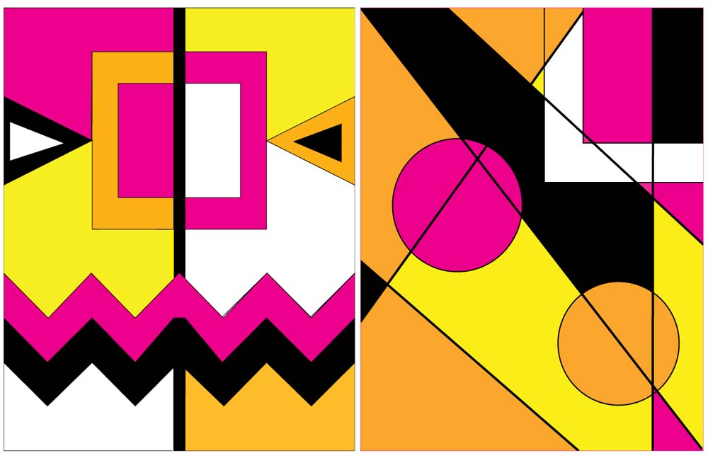
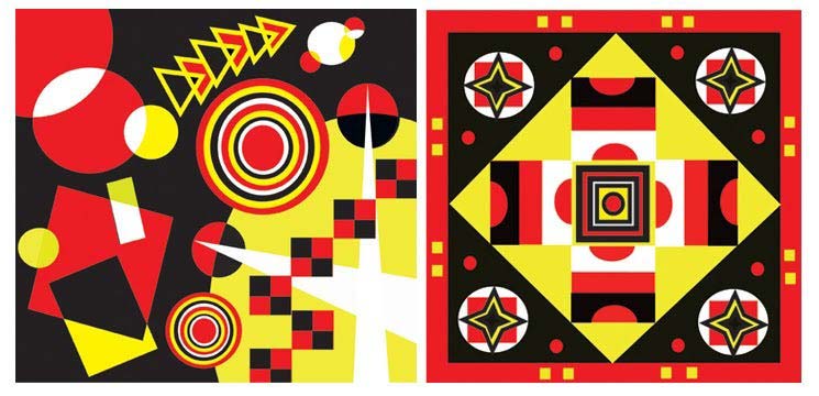
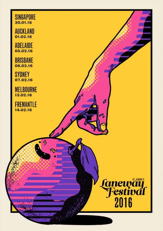
- Asymmetry in Design: Asymmetry refers to the lack of balance between elements in a design. While traditional layouts often rely on symmetrical arrangements, asymmetry deliberately avoids perfect balance to create a more dynamic and visually intriguing composition. Asymmetry can be applied to any element—whether it’s text, images, or white space—where elements are intentionally placed off-center or unevenly distributed.
- Experimental Layouts: Experimental layouts break away from conventional grid systems, using non-traditional and often unpredictable approaches to layout design. These layouts may be irregular, overlapping, or fragmented, with elements deliberately placed in unconventional ways to create tension, energy, and interest. Experimental layouts challenge the norm, often using techniques such as unexpected positioning, minimalism, overlapping elements, or large empty spaces to make a bold visual statement.
Together, asymmetry and experimental layouts offer a creative departure from traditional design, embracing imperfection, movement, and the unexpected. The result is often a striking, memorable design that encourages users to engage more deeply with the content.
Why Asymmetry and Experimental Layouts Are Gaining Popularity
Asymmetry and experimental layouts are increasingly making their way into mainstream design for several reasons:
- Breaking the Mold: The digital world is saturated with similar, predictable designs. Users have grown accustomed to grid-based, symmetrical layouts that, while functional, can feel sterile and unremarkable. Asymmetry and experimental layouts provide an opportunity to create something unique and fresh that grabs attention and stands out in a crowded digital landscape.
- Reflecting Modern Aesthetics: Today’s consumers are drawn to more dynamic and fluid designs. Asymmetry and experimental layouts align with contemporary tastes, offering a modern, creative aesthetic that feels more authentic and personal. They offer a sense of artistic expression, rebellion against the rigid formality of traditional design, and a touch of organic, free-flowing energy.
- Engagement Through Curiosity: Unconventional layouts spark curiosity. By breaking the traditional design rules, users are more likely to engage with the design in an active way, exploring how elements are placed and interacting with the page. Asymmetry encourages users to look at a design from different angles and spend more time exploring what’s on the screen.
- The Rise of Digital Art and Creativity: With the increasing popularity of digital art, web design, and mobile app design, there’s been a noticeable shift toward more creative, experimental approaches. Asymmetry and experimental layouts allow designers to express more individuality, creativity, and authenticity in a digital space that often feels homogeneous.
The Benefits of Asymmetry and Experimental Layouts
- Visual Interest and Impact: Asymmetry creates a sense of movement, tension, and surprise in a design. By breaking away from predictable layouts, asymmetrical compositions naturally attract attention, holding the viewer’s gaze longer and creating a more engaging experience. This increased visual interest can help a brand or message stand out in a crowded market.
- Encourages Exploration: A non-traditional layout invites users to explore the design more actively. They might hover over elements, click to interact, or follow visual cues to discover content. This engagement can increase the overall user experience, particularly when it’s used to guide users through a journey or narrative.
- Freedom and Flexibility: Asymmetry and experimental layouts allow for greater creative freedom. Designers can take risks with placement, spacing, and proportions, creating truly unique compositions. It opens up new possibilities for innovative, personalized designs that can better reflect the identity and tone of a brand or product.
- Enhanced Storytelling: These layouts can be used to tell a story in a more compelling way. By placing key elements off-center or layering them over each other, designers can create a visual narrative that feels more organic and less structured. This allows for storytelling that aligns with the themes of modern life—chaotic, unpredictable, and full of movement.
- Breaking the Grid: Using experimental layouts enables designers to step outside the confines of rigid grid systems. While grids are essential for ensuring consistency, an experimental approach offers flexibility and the ability to break the rules when needed. This flexibility enables the creation of truly distinctive, boundary-pushing designs.
Design Considerations for Asymmetry and Experimental Layouts
While asymmetry and experimental layouts offer tremendous creative potential, they also require careful consideration to avoid confusion or overwhelming the user. Here are some key considerations:
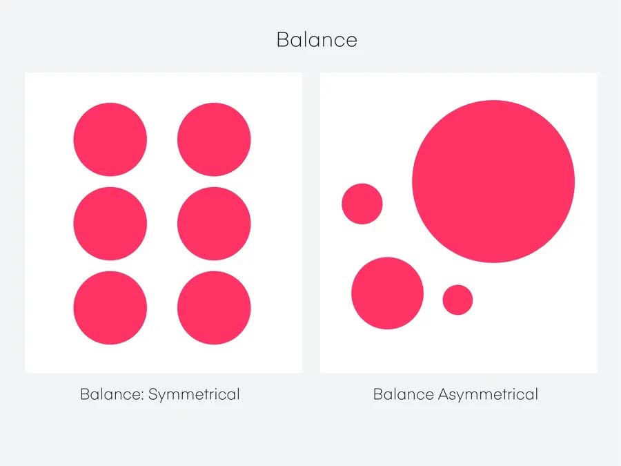
- Balance Within Chaos: While asymmetry can feel chaotic, it’s important to maintain an underlying balance within the design. Elements should still feel cohesive and deliberate. It’s important to ensure that the asymmetrical placement doesn’t disrupt the overall flow of the design.
- Hierarchy and Readability: Even in non-traditional layouts, clarity is key. Prioritize visual hierarchy to guide the user’s eye and make the content easy to navigate. Ensure that text is legible, and important elements are easily discoverable despite the non-traditional layout.
- Whitespace and Breathing Room: Asymmetry can be very dynamic, but it can also lead to a cluttered design if not carefully balanced. Strategic use of whitespace (or negative space) is essential in experimental layouts to allow elements to breathe and avoid visual overload.
- Responsive Design: When using experimental layouts, ensure the design remains functional and aesthetically pleasing across various screen sizes. The flexibility of non-traditional layouts can sometimes create challenges when adapting to different devices, so responsive design is key to maintaining a smooth user experience.
- Consistency in Branding: While experimental layouts offer creativity, it’s important that they remain consistent with the brand’s overall identity. Asymmetry should still align with the brand’s tone, values, and style. Too much deviation can cause confusion and disconnect the user from the brand message.
Case Studies: Successful Use of Asymmetry and Experimental Layouts
Awwwards:
Awwwards, a platform that celebrates design excellence, often showcases websites that embrace asymmetry and experimental layouts. Many of these sites use dynamic, overlapping elements and bold typography to create a striking user experience. For example, some feature asymmetrical grid systems where images and text float at odd angles, creating a sense of movement and unpredictability.
Apple:
Apple’s product pages often incorporate subtle asymmetry to create sleek, modern designs. Rather than adhering to a perfect grid, Apple plays with proportions and spacing, using negative space to emphasize the product itself. The website’s layout often feels organic, with elements flowing naturally across the page, encouraging exploration.
Patagonia:
Patagonia uses asymmetry and experimental layouts in its online store and marketing campaigns to communicate a sense of adventure and environmental consciousness. The website often features product images at unusual angles, with key content layered on top of vibrant, organic imagery. This reflects the brand’s commitment to a bold and environmentally conscious message.
Nike:
Nike’s digital campaigns and product pages often push the envelope with experimental layouts. The design often includes split-screen layouts, diagonal text blocks, and interactive elements that guide users through a visually dynamic experience. Nike uses asymmetry to convey movement and energy, aligning with its athletic brand ethos.
How You Can Apply These Trends in Your Work
If you’re a designer looking to integrate asymmetry and experimental layouts into your work, here are some tips:
- Start Small: If you’re new to asymmetry and experimental layouts, begin by incorporating subtle changes. Use off-center text or images and gradually experiment with more dynamic layouts as you grow comfortable with the process.
- Experiment with Grids: While stepping away from traditional grids, consider using modified grid structures. You can use asymmetrical grids or broken grids to create dynamic compositions that still maintain a sense of order.
- Focus on User Flow: While being experimental, always keep the user experience in mind. Use asymmetric elements to lead the eye, draw attention to key areas, and create natural flow throughout the page or app.
- Play with Overlapping Elements: Layering images, text, and other UI components in unexpected ways can create depth and visual interest. Just be careful to ensure that each element remains readable and easy to interact with.
- Use Asymmetry to Reflect Brand Values: Asymmetry and experimental layouts work particularly well for brands with a bold, creative, or unconventional identity. Use these techniques to visually communicate the uniqueness of the brand.
Conclusion
Asymmetry and experimental layouts are no longer just trends—they’re a revolution in the way we think about design. By embracing these unconventional approaches, designers can create more engaging, visually dynamic, and memorable digital experiences. This trend is a celebration of creativity, individuality, and freedom, allowing designers to break free from traditional constraints and create interfaces that feel fresh, exciting, and deeply engaging.
By integrating these elements thoughtfully, you can push the boundaries of your designs and deliver truly unique experiences that capture users’ attention and inspire action.
References
Green, A., 2023. The Power of Asymmetry in Web Design. UX Design Trends, 35(1), pp. 42-55.
Johnson, S., 2022. Creative Layouts: How Experimental Design is Changing the Digital Landscape. Design Today, 28(3), pp. 85-92.
Patagonia, 2022. Patagonia’s Unique Branding Approach Using Asymmetry in Design. Available at: www.patagonia.com [Accessed 2 March 2025].
Nike, 2021. Nike’s Use of Asymmetry and Experimental Layouts for Powerful Campaigns. Available at: www.nike.com [Accessed 2 March 2025].