
Dark Mode & High-Contrast UI: The Design Trend Revolutionizing User Experience

Introduction
In the ever-evolving world of digital design, certain trends come and go, but some stick around due to their undeniable impact on user experience (UX). One such trend that has been making waves over the past few years is the rise of dark mode and high-contrast UI designs. Initially a preference for those who favored a sleek, minimalistic aesthetic, dark mode has now become a mainstream feature in applications, websites, and operating systems. Paired with high-contrast elements, this design trend is proving to be more than just a visual shift; it’s about improving accessibility, reducing eye strain, and enhancing overall usability.
In this blog post, we will dive deep into the growing popularity of dark mode and high-contrast UI designs, explore the reasons behind their widespread adoption, and examine how these trends are reshaping the way we interact with technology. We will also provide insights on how you can apply dark mode and high-contrast UI in your own design projects to optimize user experience.

What is Dark Mode and High-Contrast UI?
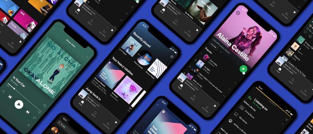
Dark Mode: Dark mode refers to a user interface design that utilizes dark backgrounds, usually black or dark gray, with lighter text and elements. It’s a popular alternative to the traditional light mode (white background with dark text) and is often chosen for its visually appealing, minimalist aesthetic. Dark mode can reduce the amount of light emitted by screens, making it easier to use devices in low-light environments.
High-Contrast UI: High-contrast UI design focuses on the deliberate use of contrasting colors to ensure that key elements stand out. High-contrast design typically features dark backgrounds with bright text and UI components, making the interface clearer and more legible, especially for users with visual impairments. This design style ensures readability and visual clarity, making interactions more intuitive.
While dark mode focuses on aesthetics and reducing eye strain, high-contrast UI has accessibility and readability at its core. Both design styles are closely linked, often used together to provide a comfortable and accessible digital experience.

Why Dark Mode and High-Contrast UI Are Gaining Popularity
Dark mode and high-contrast UI are rapidly becoming standard features across digital platforms, from social media apps to professional software. There are several factors driving this shift:
User Preference: More users are actively seeking dark mode as an alternative to traditional light interfaces. It provides a visually pleasing and modern aesthetic that appeals to users who enjoy a sleek, minimalist look. With the rise of mobile apps, operating systems, and even websites offering dark mode as a built-in option, this trend has become ubiquitous.
Health Considerations: As people spend more time on their devices, eye strain has become a significant concern. Bright screens, especially in low-light settings, can cause discomfort and disrupt sleep patterns. Dark mode addresses this by reducing the overall screen brightness, offering a more relaxed visual experience that is easier on the eyes, particularly in low-light environments.
Improved Accessibility: High-contrast UI design is essential for improving accessibility for users with visual impairments. It ensures that text, buttons, and other UI elements stand out clearly against the background, enhancing readability and navigation. This focus on contrast and visibility helps users with color blindness, low vision, and other visual challenges engage more effectively with the interface.
Battery Life: On OLED screens, dark mode has the added benefit of saving battery life. Since OLED displays can turn off pixels that are black, using dark mode can result in a significant reduction in power consumption, making devices more energy-efficient.
Branding and Aesthetic Appeal: As brands seek to differentiate themselves in a crowded digital space, dark mode provides a unique design language that helps create memorable and striking interfaces. This sleek, contemporary style has been adopted by many major companies to give their digital products a modern, premium feel.

The Benefits of Dark Mode and High-Contrast UI
The combination of dark mode and high-contrast UI offers numerous advantages, both in terms of user experience and functionality:
Reduced Eye Strain: The most immediate benefit of dark mode is its ability to reduce eye strain, especially in low-light environments. By using darker backgrounds and lighter text, the contrast is softer on the eyes, minimizing fatigue from prolonged use of screens.
Improved Focus: Dark mode helps users concentrate on the content by reducing distractions from bright, light-colored backgrounds. The darker interface allows text, images, and other key elements to pop, making the focus areas more prominent.
Better Nighttime Usage: With many users accessing their devices in dimly lit environments, dark mode offers a more comfortable and less disruptive experience, allowing users to engage with content without disturbing their surroundings or their circadian rhythms.
Enhanced Visual Hierarchy: High-contrast UI design provides a more defined visual hierarchy, with critical elements standing out clearly. Text becomes more legible, navigation becomes easier, and important buttons are more noticeable, improving overall usability.
Increased Accessibility: High-contrast UI designs make content more accessible to individuals with visual impairments, such as those with color blindness or low vision. By ensuring clear differentiation between elements, high contrast allows for a more inclusive user experience.
Battery Conservation (for OLED Screens): As mentioned earlier, dark mode significantly reduces the energy consumption of devices with OLED screens. This is especially beneficial for mobile phones, where battery life is a key concern.
Design Considerations for Dark Mode and High-Contrast UI
When implementing dark mode and high-contrast UI design, there are a few important considerations to ensure the design remains effective and user-friendly:
Color Choices: While dark mode typically uses dark backgrounds, selecting the right shades is crucial. Pure black backgrounds can cause too much contrast, leading to “halation” effects around text. Dark grays are often better as they provide softer, more comfortable backgrounds without sacrificing readability.
Text Readability: In dark mode, ensuring that text is easy to read is paramount. The text should be light enough to stand out against the dark background, but not so bright that it becomes harsh on the eyes. It’s important to use font styles and sizes that maintain readability even in low-light conditions.
Interactive Elements: Buttons, links, and other interactive UI elements must be clearly distinguishable in dark mode. High contrast can help make these elements stand out against the background, but it’s important to balance contrast with aesthetics so that the design remains sleek and visually pleasing.
Use of Shadows and Highlights: Shadows and highlights can be used effectively in dark mode and high-contrast UI design to add depth and dimension to the interface. These elements help separate different layers of the design, such as cards or buttons, while maintaining a cohesive look.
User Customization: Some users may prefer light mode or specific color schemes for accessibility reasons. Offering the option to switch between dark and light modes, or customize contrast settings, ensures that all users have a choice in their interface experience.

Case Studies: Successful Implementation of Dark Mode and High-Contrast UI
Instagram’s dark mode implementation offers users the option to switch to a sleek black background with light text, offering a more comfortable experience in low-light conditions. The high contrast between text, images, and UI elements ensures that key content stands out, creating a clear visual hierarchy.
YouTube’s dark mode provides users with a visually rich experience that minimizes distractions. The contrast between the video thumbnails and the dark background makes videos pop, allowing users to focus on content while reducing eye strain during long viewing sessions.
Apple:
Apple’s macOS and iOS devices offer dark mode across their entire ecosystem, from apps to system interfaces. The integration of high-contrast UI in Apple’s dark mode provides accessibility options for users with visual impairments while maintaining a sleek and modern look. The clean contrast between text and UI components enhances both readability and usability.
Slack’s dark mode is an excellent example of how dark mode and high-contrast UI can improve communication platforms. The dark background allows users to focus on messages and conversations, while high-contrast UI elements like notification badges and buttons ensure quick and easy navigation.

How You Can Apply These Trends in Your Work
If you’re a designer looking to implement dark mode and high-contrast UI in your projects, here are some practical tips:
Consider User Preferences: Provide users with the option to toggle between light and dark modes, or let them choose their preferred level of contrast. This allows users to tailor their experience based on their preferences and needs.
Optimize for Accessibility: Ensure that your dark mode and high-contrast designs are accessible to all users, including those with visual impairments. Use tools like contrast checkers to ensure text and UI elements are legible, and test your designs with screen readers and other assistive technologies.
Maintain a Consistent Theme: When implementing dark mode, ensure that the visual language remains consistent across your interface. Use consistent color schemes, fonts, and icons to ensure the design feels cohesive and balanced.
Test in Different Environments: Make sure to test your dark mode and high-contrast designs in various lighting environments to ensure they provide an optimal user experience in both dark and bright conditions.

Conclusion
Dark mode and high-contrast UI are not just passing trends—they are integral components of modern design that significantly enhance user experience. By providing a visually comfortable environment, reducing eye strain, and improving accessibility, these design trends are transforming how users interact with digital products. As more users demand interfaces that are not only aesthetically pleasing but also functional and accessible, embracing dark mode and high-contrast UI design is a smart choice for any designer looking to stay ahead in the ever-evolving world of digital design.

References
Apple, 2023. How to Use Dark Mode on Your Mac, iPhone, and iPad. Available at: www.apple.com [Accessed 2 March 2025].
Google, 2022. Dark Theme: Best Practices for Accessibility. Material Design. Available at: www.material.io [Accessed 2 March 2025].
Sweeney, A., 2023. The Rise of High-Contrast UI and Its Benefits for Accessibility. UI/UX Journal, 29(5), pp. 65-78.
Slack Technologies, 2021. Introducing Dark Mode in Slack. Available at: www.slack.com [Accessed 2 March 2025].
Introduction: In an increasingly digital world, user experience (UX) is the key to staying ahead of the competition. Designers are…