
Helvetica: One of the Most Popular Fonts in the World
When it comes to popular fonts, few are as instantly recognizable as Helvetica. Over the decades, this typeface has become a staple in design, branding, and advertising, earning its place as one of the most widely used fonts in the world. Helvetica’s clean lines, neutral appearance, and versatility have made it the go-to choice for designers, corporations, and public institutions alike.
In this blog post, we’ll dive into the history and impact of Helvetica, exploring how it rose to prominence, why it became a favorite of designers worldwide, and what makes it such a timeless and beloved font.

-
The Creation of Helvetica: A Revolution in Typeface Design

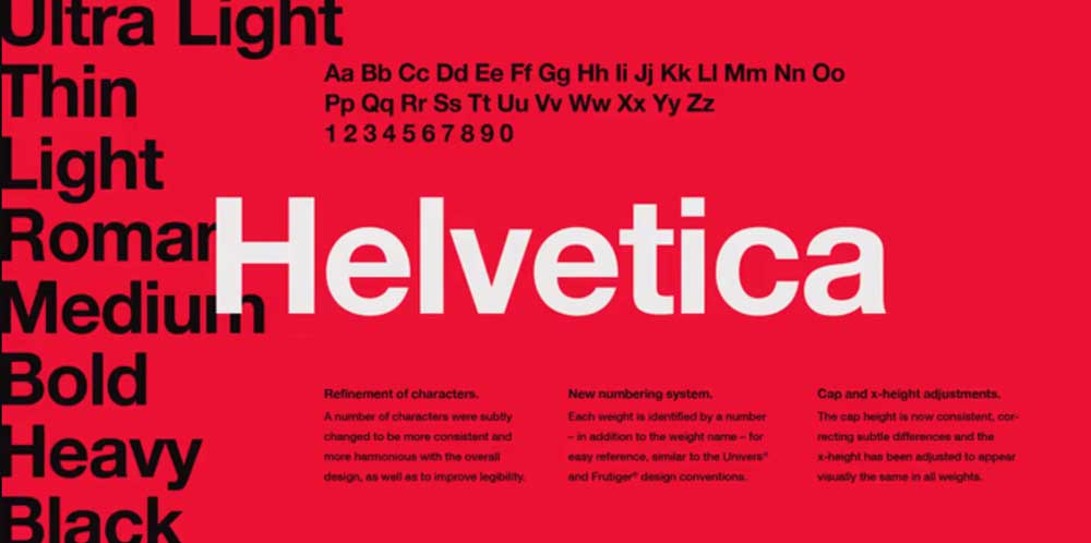
Helvetica was created in 1957 by Swiss typeface designer Max Miedinger with input from Eduard Hoffmann, the director of the Haas Type Foundry in Switzerland. Initially named “Neue Haas Grotesk,” the font was designed to be neutral, clean, and highly legible—qualities that made it ideal for a wide range of applications, from corporate logos to signage.
Helvetica belongs to the sans-serif typeface family, meaning it lacks the small projecting features called serifs at the ends of letters, which gives it a modern, streamlined look. Miedinger’s goal was to create a font that felt universally appealing and uncluttered. After a rebranding effort in the 1960s, it was officially renamed Helvetica, derived from the Latin word for Switzerland, “Helvetia.” This name change symbolized the Swiss tradition of precision, craftsmanship, and design, all qualities that would soon define the typeface.
Why Helvetica Became So Popular

Helvetica’s popularity grew steadily throughout the mid-20th century and continues to endure today, largely due to several key factors:
- Neutral Design: Helvetica was intentionally designed to be neutral—it didn’t convey any particular emotion or feeling. This made it highly versatile, allowing it to be used in a wide range of contexts, from corporate branding to public signage.
- Legibility: The clarity and simplicity of Helvetica’s design made it incredibly easy to read, even at small sizes. This made it the preferred typeface for print media, advertising, and information design.
- Modernist Appeal: Helvetica’s clean lines and minimalistic design fit perfectly with the ideals of the modernist design movement, which sought to eliminate unnecessary ornamentation and emphasize functionality. It became synonymous with the post-WWII aesthetic of progressive and forward-thinking design.
- Adoption by Major Brands: Companies like American Airlines, Panasonic, and BMW adopted Helvetica in their branding, giving the font a global presence. Its use in the corporate world helped cement its place as the typeface of choice for professional and polished communication.
The Influence of Helvetica on Design and Branding

Helvetica’s neutrality and versatility have had a profound influence on the fields of graphic design and branding. It has shaped the way companies communicate with their audiences, giving a sense of professionalism, clarity, and modernity. Some notable ways Helvetica has impacted design include:
- Corporate Identity: Many companies and institutions chose Helvetica for their logos and branding because it conveyed a sense of reliability, clarity, and universality. The font became the face of corporate design during the 1960s and 1970s and remains integral to modern branding.
- Signage and Wayfinding: The font’s high legibility made it an ideal choice for public signage and wayfinding systems. Cities, transportation networks, and institutions around the world adopted Helvetica for their public signage, helping guide millions of people every day.
- Advertising: Helvetica’s simplicity made it an ideal choice for advertisements, as its clean lines ensured that the message would be easily understood. The typeface became a key tool for visual communication, delivering clarity and impact with minimal distraction.
Helvetica in Pop Culture

Helvetica has long been a cultural phenomenon, gaining recognition not only in the design world but also in popular culture:
- The 2007 Documentary Helvetica: One of the most significant moments in the font’s pop culture history came with the release of Gary Hustwit’s documentary Helvetica. The film explores the history, cultural significance, and widespread influence of the font. It sparked a broader conversation about the power of typography and its role in shaping our visual world.
- Design and Art: Helvetica’s iconic status in design culture has made it a favorite among graphic designers and artists. Many contemporary artists incorporate Helvetica into their work as a symbol of modern design.
- Criticism and Debate: Despite its widespread use, Helvetica has also been the subject of criticism for being too ubiquitous or “boring.” Some argue that its neutrality can make it feel impersonal or overused. These debates have contributed to the ongoing conversation about the importance of typography in the modern age.
Helvetica vs. Other Fonts: A Comparison

While Helvetica’s dominance is undeniable, it’s important to recognize its role in the broader typographic landscape. Other fonts, such as Arial and Univers, have often been compared to Helvetica. Here’s a breakdown of some of the key differences:
- Helvetica vs. Arial: Arial, which was developed by Monotype in the 1980s, is often seen as a similar alternative to Helvetica. While both fonts are sans-serif and share similar characteristics, Helvetica’s design is more refined, with more consistent proportions and tighter spacing.
- Helvetica vs. Univers: Univers, designed by Adrian Frutiger in the 1950s, is another clean, modern typeface that shares Helvetica’s neutral qualities. However, Univers has a wider range of weights and widths compared to Helvetica, which gives it more flexibility.
While other fonts have emerged as strong competitors, Helvetica remains the quintessential modern typeface due to its timeless design and universal appeal.
The Future of Helvetica
Helvetica remains one of the most enduring typefaces in the world. Despite the rise of new fonts and changing design trends, Helvetica continues to be a staple in both print and digital design. Some trends for its future include:
- Digital Typeface Evolution: As digital design becomes more prevalent, Helvetica continues to adapt, with new font weights and optimized digital versions to maintain legibility across devices.
- Reinterpretations of Helvetica: Many contemporary designers continue to experiment with Helvetica by modifying its spacing, proportions, or even adding personalized elements to create unique versions of the classic font.
- Continued Popularity in Branding: Helvetica’s timeless professionalism and clarity will likely continue to make it a favored choice for companies and brands seeking a clean and reliable visual identity.
Conclusion: Helvetica’s Timeless Appeal

Helvetica is more than just a font—it’s a cultural icon that has shaped the way we perceive design, branding, and communication. Its rise to prominence as one of the most popular fonts in the world is a testament to its versatility, legibility, and timeless elegance.
Whether used in corporate logos, advertising, or wayfinding systems, Helvetica’s enduring appeal lies in its ability to communicate clearly and universally, making it a cornerstone of modern design.
References
- Hustwit, G. (2007) Helvetica: A Documentary on the World’s Most Famous Typeface. New York: Design Films.
- Lichtenstein, N. (2012) The Helvetica Phenomenon: How One Typeface Changed the World. London: Phaidon Press.
- Frutiger, A. (1990) The Helvetica Debate: Typography in the Modern World. Zurich: Type Archive.
- Smith, R. (2015) Helvetica and Beyond: The Evolution of Modern Typefaces. New York: HarperCollins.

Introduction: The Role of Fonts in Reading In the digital age, we spend a large portion of our time reading…
For centuries, designers, artists, and architects have relied on the golden ratio to create works of aesthetic harmony and balance….