
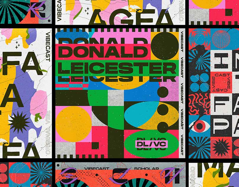
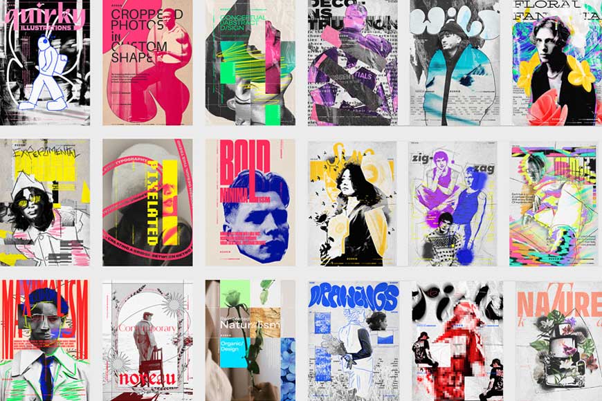
Bold and Vibrant Colors: The Graphic Design Trend That’s Taking Over

In the world of graphic design, color is a powerful tool that can communicate emotions, create visual interest, and establish a brand’s identity. While minimalism and muted tones have dominated the design world for years, a bold shift is occurring. The use of vibrant, eye-catching colors is making a big splash in 2025, giving designs a lively, energetic feel. This trend is about breaking free from the conventional and embracing bold, unapologetic hues that demand attention.
But what does it mean to embrace bold and vibrant colors in graphic design? And how can you effectively incorporate this trend into your work? In this blog post, we’ll explore the power of bold color choices, the psychology behind them, and the various ways they’re influencing modern graphic design. We’ll also cover practical tips on how to apply this trend and dive into case studies of successful designs that have embraced vibrant palettes.
The Rise of Bold and Vibrant Colors in Graphic Design
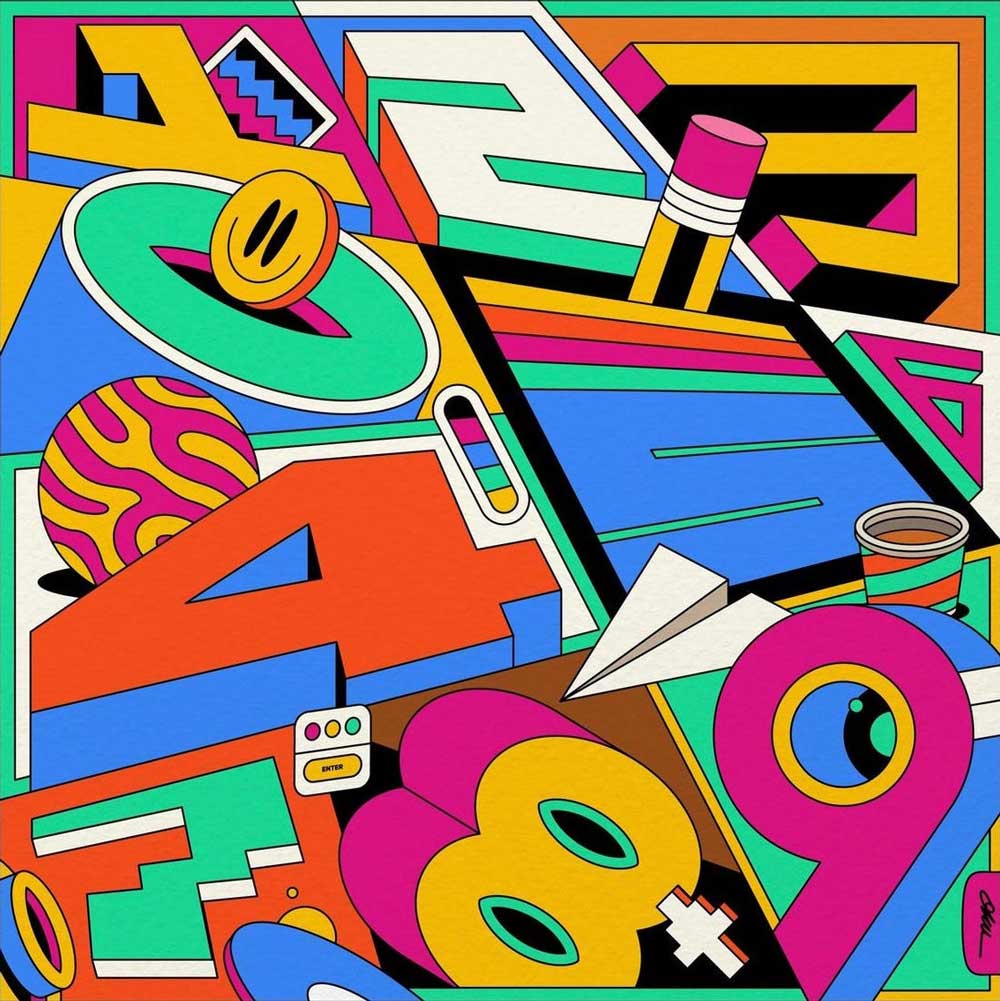
In the past, design trends have favored more subtle and neutral palettes, especially in branding and corporate design. However, with the rise of social media, digital art, and consumer demand for more engaging and dynamic visuals, bold and vibrant colors have found their way into the spotlight. This design trend isn’t just about bright, neon tones—it’s about using color to express energy, individuality, and creativity.
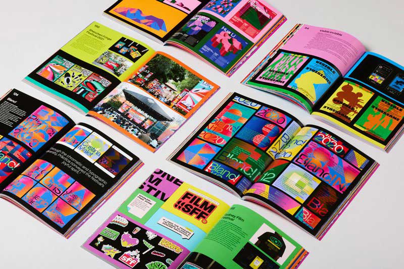
In 2025, bold colors are appearing everywhere, from websites and advertisements to product packaging and logo design. Designers are increasingly using vivid hues, gradients, and contrasting color schemes to create designs that stand out in a world flooded with information. By choosing colors that are bold and attention-grabbing, designers are able to communicate more effectively and create a stronger emotional connection with their audiences.
The Psychology of Color: Why Bold Colors Matter

Colors have the ability to evoke specific emotional responses in people, and understanding color psychology is a crucial element in graphic design. Bold and vibrant colors are particularly effective at creating high-energy visuals that grab attention and leave a lasting impact.
- Red: Often associated with passion, excitement, and urgency, red is a color that can stimulate action. It’s frequently used in marketing and advertising to encourage impulse buying or to make bold statements.
- Blue: While blue can be calming and trustworthy, when used in vibrant shades, it can convey innovation and creativity. It’s a popular choice for tech and finance companies aiming to project reliability while maintaining a modern, forward-thinking image.
- Yellow: Bright and cheerful, yellow brings optimism and happiness to a design. It’s commonly used to draw attention and evoke feelings of positivity and warmth.
- Green: Often linked to nature and sustainability, green in bold hues can also signify growth and progress. It’s a great color for brands with an eco-friendly focus.
- Purple: Purple’s vibrancy can evoke creativity, luxury, and mystery. It’s an ideal color for high-end products or brands seeking to convey sophistication and originality.
The psychology of these colors, when used correctly, can influence how a brand or message is perceived. By strategically choosing bold colors that align with the desired emotion or brand identity, designers can craft more impactful visual experiences.
How to Effectively Use Bold and Vibrant Colors

While bold and vibrant colors have a strong visual impact, they need to be used thoughtfully to avoid overwhelming the viewer or causing visual clutter. Here are some tips for incorporating these colors into your designs effectively:
- Balance is Key: Don’t overuse bold colors. Pairing them with neutral tones or muted colors helps create contrast and keeps the design visually appealing without being too overwhelming. For example, a bright yellow background with black text can make the text pop, but using too much yellow could become exhausting to the eyes.
- Use Color Hierarchy: Establish a clear hierarchy in your design by giving primary importance to one or two bold colors. This will help guide the viewer’s eye and keep the design organized. A balanced use of vibrant colors alongside smaller amounts of more neutral tones can help emphasize the key elements.
- Gradients and Color Transitions: A growing trend in graphic design is the use of color gradients—seamless transitions between two or more vibrant colors. This technique adds depth and dynamism to a design while avoiding the harshness of solid color blocks. It’s particularly effective in web design and digital art.
- Cultural Sensitivity: While bold colors can make a strong statement, it’s important to understand the cultural context behind them. For instance, while red might symbolize excitement in Western cultures, it can represent danger or warning in other parts of the world. Ensure that the colors you use resonate with your target audience.
- Contrast and Legibility: When using bold colors for text, ensure that there is enough contrast between the background and the text. Light text on a dark background (or vice versa) helps improve readability while maintaining a vibrant look.
The Role of Color in Branding and Identity
Color plays a significant role in establishing a brand’s identity, and the use of bold colors can help set a brand apart in a crowded market. Many global brands are leaning into vibrant hues to express their personality and connect with younger, more dynamic audiences.
- Nike: Known for its bold use of black and vibrant accent colors, Nike’s branding speaks to energy, movement, and performance. Their color choices reinforce the brand’s identity as one that champions athleticism and motivation.
- Spotify: Spotify’s signature green is a bold and vibrant choice that conveys freshness and vibrancy. It stands out among other music streaming platforms and aligns with the platform’s youthful and energetic user base.
- Airbnb: Airbnb’s use of a warm, inviting coral pink color for its logo and branding reflects the company’s commitment to making travel feel personal, welcoming, and easy. The color is vibrant and friendly, suggesting warmth and hospitality.
Bold colors are more than just visually appealing—they help form emotional connections with a brand and can drive customer recognition. By selecting colors that align with the company’s values and message, brands can create a stronger, more consistent identity.
Case Studies: Successful Use of Bold Colors in Design
Instagram’s Rebrand (2016):
Instagram’s rebrand in 2016 embraced vibrant gradient colors as part of its new logo and app design. The transition from a traditional flat design to a gradient was a bold move that mirrored the platform’s shift towards more creative and expressive content. The colorful logo is now iconic, embodying Instagram’s creative community and dynamic approach to social media.
Dropbox (2020):
Dropbox’s 2020 rebrand saw a shift to bold colors and quirky illustrations. By introducing a vibrant and playful color palette, Dropbox moved away from its more corporate, utilitarian roots to connect with a younger, more creative demographic. This colorful overhaul aligned with the brand’s mission to make file sharing and collaboration more fun and accessible.
Spotify Wrapped:
Spotify Wrapped is another example of using bold and vibrant colors effectively. Each year, Spotify releases personalized user reports that incorporate a mix of bright, contrasting colors. This not only makes the content visually appealing but also boosts user engagement by adding an element of surprise and excitement.
How You Can Apply This Trend in Your Work
If you’re a graphic designer or content creator looking to implement bold and vibrant colors in your projects, here are some ways to get started:
- Explore Color Psychology: Take time to understand the emotional impact of colors and how they align with your project’s goals. Consider the feeling you want to evoke and the type of audience you want to attract.
- Experiment with Color Combinations: Don’t be afraid to mix different bold colors together. Explore complementary, analogous, or even contrasting color schemes to create visually striking designs.
- Incorporate Gradients: Experiment with gradients to add depth to your designs. Try combining two or more bold hues in a smooth transition, creating a dynamic, modern aesthetic.
- Stay On-Brand: While vibrant colors are exciting, always keep in mind the brand or project’s values. Bold colors should enhance, not overpower, the overall message you are trying to convey.
Conclusion
Bold and vibrant colors are no longer just a trend—they are a powerful tool for designers to communicate energy, creativity, and individuality. From branding to digital design, this trend is reshaping the graphic design landscape, making designs more engaging and memorable.
By embracing bold color choices and understanding the psychology behind them, designers can elevate their work and make a lasting impression on their audiences. Whether you’re designing a website, logo, or social media content, vibrant colors can help you create dynamic, attention-grabbing designs that stand out in a crowded world of visual stimuli.
References
Johnson, M., 2024. The Psychology of Color in Graphic Design: Understanding Emotional Impact. Design Today, 32(6), pp. 45-52.
Spotify, 2022. Spotify’s Branding Strategy and Use of Color. Available at: www.spotify.com [Accessed 2 March 2025].
Wells, C., 2023. The Rise of Bold Colors in Graphic Design. Visual Trends Magazine, 41(3), pp. 110-122.
Zhang, L., 2021. Exploring the Role of Color in Branding and Identity Design. Branding Journal, 19(2), pp. 98-105.
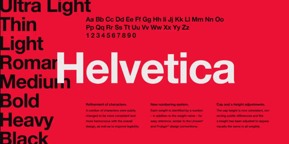
When it comes to popular fonts, few are as instantly recognizable as Helvetica. Over the decades, this typeface has become…
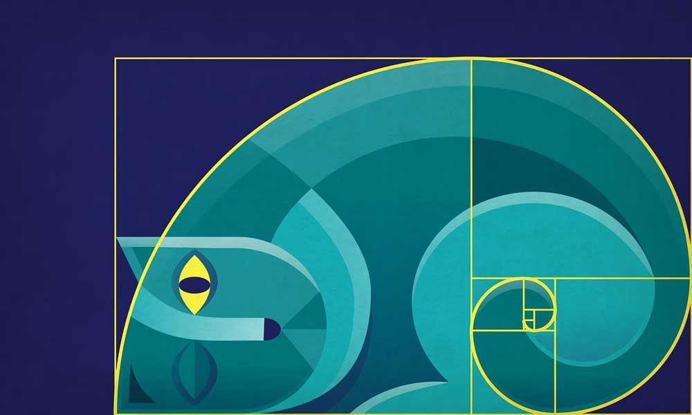
For centuries, designers, artists, and architects have relied on the golden ratio to create works of aesthetic harmony and balance….